

The proliferation of data centers, essential infrastructure for the burgeoning field of Artificial Intelligence, has ignited widespread public discourse and concern. As AI companies rapidly expand their digital footprints, local communities are increasingly voicing opposition, citing the appropriation of vital public resources like electricity and water to fuel the growth of wealthy corporations. A prevalent sentiment, shared across the political spectrum, is that the establishment of data centers will significantly diminish the quality of life for residents in adjacent areas and the broader community. This article delves into the risks associated with data centers by implementing a sophisticated Bayesian Network, offering a comprehensive analysis designed for a diverse audience, from concerned citizens seeking clarity on potential community impacts to analysts intrigued by the application of Bayesian Networks. The model developed herein is particularly tailored for decision analysts familiar with Bayesian Networks but perhaps less so with the R programming language, demonstrating the potent capabilities of open-source software in contrast to proprietary systems.
Beyond the core subject of data center risks, the analysis presented here relies on no original research, save for the innovative contribution of ChatGPT 5.6 Luna, which assisted in generating synthetic data through a series of specified requirements.
Understanding Data Center Risks
A rational discourse surrounding the perceived risks associated with data center construction necessitates a structured approach to organizing information and opinions. This framework should facilitate a risk analysis flexible enough to accommodate the complex interplay of various risk factors. The Bayesian Network presented in this analysis represents an initial step toward developing such a critical tool.
Generally, the risks imposed by data centers can be categorized as follows:
- Resource Strain: Data centers are voracious consumers of electricity and water. Their immense power requirements can strain local grids, potentially leading to price increases or reliability issues. Similarly, their substantial water needs for cooling can deplete local water resources, especially in regions already facing scarcity.
- Environmental Impact: Beyond resource consumption, data centers contribute to environmental degradation through greenhouse gas emissions from backup generators, potential thermal pollution of water bodies used for cooling, and the significant land footprint required for their construction and operation.
- Community Disruption: The construction and ongoing operation of data centers can lead to increased traffic congestion, noise pollution, and visual blight, negatively impacting the quality of life for nearby residents. Furthermore, the demand for skilled labor can place pressure on local housing markets and public services.
- Economic and Social Equity: While proponents highlight potential economic benefits like job creation and tax revenue, critics argue these benefits are often insufficient to offset the environmental and social costs. Concerns also arise regarding the equitable distribution of these benefits and the potential for data centers to exacerbate existing environmental justice issues.
Potential Benefits of Data Centers
Supporters of data center development frequently emphasize the potential economic advantages. These typically include:
- Increased Tax Revenue: Data centers, representing significant capital investments, can contribute substantial property taxes and other levies to local and state governments, potentially funding public services and infrastructure improvements.
- Job Creation: The construction phase of a data center typically generates temporary employment opportunities for skilled tradespeople and laborers. Operational roles, while fewer in number, often offer competitive salaries.
However, a significant portion of investigative reporting and community feedback indicates that these economic gains may not adequately compensate for the associated risks and burdens placed upon local communities.
Organizing Risks and Benefits: A Directed Acyclic Graph
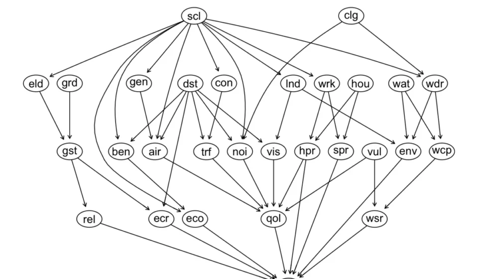
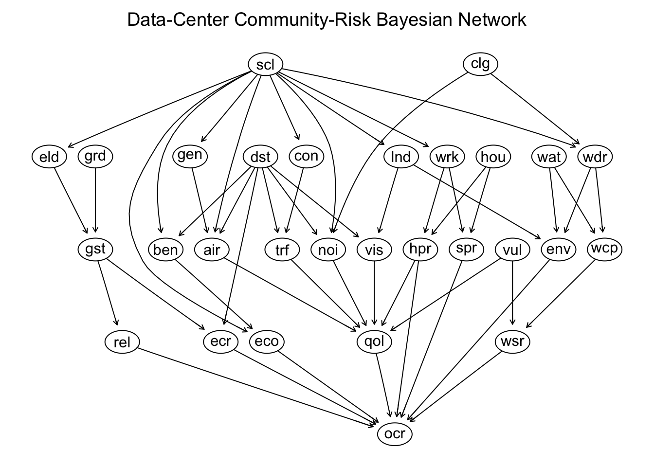
The foundation of model building lies in organizing potential risk factors and their interdependencies into a Directed Acyclic Graph (DAG). In this structure, arrows point from root nodes, representing fundamental drivers, to nodes that represent factors intensifying risk. Ultimately, the influence flows to nodes quantifying specific risk types, culminating in a node that measures overall community risk. The following graph illustrates this conceptual framework, expanding on the general risk categories and enumerating various risk factors with directional influences. Key drivers such as the scale of the data center and its proximity to residential areas are fundamental to this risk assessment.

The complexity of this graph, with its extensive list of nodes, is intentional, aiming to provide a more comprehensive example than typical introductory models. This approach allows for greater detail and nuance, making it easier to pare down for more specific custom models later.
[A visual representation of the DAG would be presented here, showing the relationships between nodes like ‘Scale’, ‘Distance’, ‘ElectricityDemand’, ‘WaterDemand’, ‘NoiseExposure’, ‘QualityOfLifeRisk’, ‘OverallCommunityRisk’, etc.]
The Bayesian Network Structure
The R programming language, specifically the bnlearn package, is utilized to construct a discrete Bayesian Network based on the conceptual DAG. This allows for the formal definition and manipulation of the network’s structure.
Defining the DAG Structure
The network structure is formally defined using a string representation that bnlearn interprets to build the DAG. This process involves specifying each node and its parent nodes, thereby defining the causal relationships within the model.
# Required packages and helper functions
library(bnlearn)
library(ggplot2)
library(Rgraphviz)
library(igraph)
library(dplyr)
library(tidyr)
library(ggridges)
library(ggtern)

# Define the expert network structure using a string format
network_string <- paste0(
  "[Distance]",
  "[Scale]",
  "[Cooling]",
  "[GridCapacity]",
  "[WaterAvailability]",
  "[HousingAvailability]",
  "[Vulnerability]",
  "[LandFootprint|Scale]",
  "[ElectricityDemand|Scale]",
  "[WaterDemand|Scale:Cooling]",
  "[ConstructionIntensity|Scale]",
  "[BackupGeneration|Scale]",
  "[WorkforceDemand|Scale]",
  "[NoiseExposure|Distance:Cooling:Scale]",
  "[AirQualityExposure|Distance:BackupGeneration:Scale]",
  "[TrafficExposure|Distance:ConstructionIntensity]",
  "[VisualLandUseExposure|Distance:LandFootprint]",
  "[AccessToBenefits|Distance:Scale]",
  "[GridStress|ElectricityDemand:GridCapacity]",
  "[ElectricityCostRisk|GridStress:Distance]",
  "[ReliabilityRisk|GridStress]",
  "[WaterCompetition|WaterDemand:WaterAvailability]",
  "[WaterSecurityRisk|WaterCompetition:Vulnerability]",
  "[HousingPressure|WorkforceDemand:HousingAvailability]",
  "[ServicePressure|WorkforceDemand:HousingAvailability]",
  "[EnvironmentalDegradation|LandFootprint:WaterDemand:WaterAvailability]",
  "[QualityOfLifeRisk|NoiseExposure:AirQualityExposure:TrafficExposure:",
  "VisualLandUseExposure:HousingPressure:Vulnerability]",
  "[EconomicBenefit|Scale:AccessToBenefits]",
  "[OverallCommunityRisk|QualityOfLifeRisk:WaterSecurityRisk:",
  "ElectricityCostRisk:ReliabilityRisk:EnvironmentalDegradation:",
  "HousingPressure:ServicePressure:EconomicBenefit]"
)

# Create the DAG object from the network string
dag <- model2network(network_string)

# Optional inspection of the DAG structure
# print(dag)
# print(modelstring(dag))
# list(nodes(dag))
Streamlining Node Names for Visualization
To enhance readability and simplify plotting, node names are abbreviated using an alias mapping. This preserves the network’s structure while making visual representations more manageable.
# Alias mapping for node names
node_alias <- c(
  Distance = "dst", Scale = "scl", Cooling = "clg", GridCapacity = "grd",
  WaterAvailability = "wat", HousingAvailability = "hou", Vulnerability = "vul",
  LandFootprint = "lnd", ElectricityDemand = "eld", WaterDemand = "wdr",
  ConstructionIntensity = "con", BackupGeneration = "gen", WorkforceDemand = "wrk",
  NoiseExposure = "noi", AirQualityExposure = "air", TrafficExposure = "trf",
  VisualLandUseExposure = "vis", AccessToBenefits = "ben", GridStress = "gst",
  ElectricityCostRisk = "ecr", ReliabilityRisk = "rel", WaterCompetition = "wcp",
  WaterSecurityRisk = "wsr", HousingPressure = "hpr", ServicePressure = "spr",
  EnvironmentalDegradation = "env", QualityOfLifeRisk = "qol", EconomicBenefit = "eco",
  OverallCommunityRisk = "ocr"
)

# Apply aliases to the network string
network_string_alias <- network_string
for (node_name in names(node_alias))
  alias_name <- unname(node_alias[node_name])
  pattern <- paste0("(?<![A-Za-z0-9_.])", node_name, "(?![A-Za-z0-9_.]))")
  network_string_alias <- gsub(pattern, alias_name, network_string_alias, perl = TRUE)


# Create the DAG using aliases
dag_alias <- model2network(network_string_alias)

# Visualize the aliased DAG
graphviz.plot(dag_alias, shape = "ellipse", main = "Data-Center Community-Risk Bayesian Network (Aliased)")
Network Statistics
Key network statistics provide insights into its structure and computational complexity. The average Markov blanket size, average neighborhood size, and average branching factor offer a quantitative understanding of node interdependencies and information flow.
# Calculate network statistics
node_names <- nodes(dag)

markov_blanket_sizes <- sapply(node_names, function(node) length(mb(dag, node)))
neighbourhood_sizes <- sapply(node_names, function(node) length(unique(c(parents(dag, node), children(dag, node)))))
branching_factors <- sapply(node_names, function(node) length(children(dag, node)))

network_statistics <- data.frame(
  Statistic = c("Average Markov blanket size", "Average neighbourhood size", "Average branching factor"),
  Value = c(mean(markov_blanket_sizes), mean(neighbourhood_sizes), mean(branching_factors))
)

network_statistics$Value <- round(network_statistics$Value, digits = 2)
print(network_statistics)
The calculated statistics reveal:
- Average Markov blanket size: 7.31. This indicates that, on average, 7.31 nodes are directly related to any given node, influencing its state.
- Average neighborhood size: 3.52. This reflects the average number of direct connections (parents and children) a node has.
- Average branching factor: 1.76. This suggests that, on average, each node influences 1.76 other nodes directly.
These metrics collectively suggest a moderately complex network with a reasonable degree of interconnectedness, allowing for detailed analysis without becoming computationally intractable.

Generating Synthetic Data for Risk Analysis
To populate the Bayesian Network and perform probabilistic inference, synthetic data is generated. This process employs a custom structural risk-propagation simulator that models the probabilistic relationships defined in the DAG. Instead of relying solely on traditional Conditional Probability Tables (CPTs), this architecture utilizes a continuous, score-based risk-mapping framework. The simulation engine processes nodes in a strict topological order, calculating a localized Target Risk Score (0-1) for each node. This score is then converted into discrete state probabilities using an exponential distance formula, enabling the linear modeling of complex, multi-parent conditional relationships.
Data Generator Architecture
The data generation algorithm categorizes DAG nodes into two types:
- Direct Nodes: These represent fundamental operational variables with direct impacts on risk. Their state-to-risk mappings are explicitly defined. For example, ‘AccessToBenefits’ or ‘EconomicBenefit’ are protective variables where higher values correlate with lower risk.
- Derived Nodes: These represent downstream outcomes like environmental, social, or infrastructure risks. Their states follow a logical progression from safe to severe and are dynamically generated using a standardized mapping.
Prior probabilities are assigned only to root nodes. For child nodes, state probabilities are dynamically generated for each observation based on the states of their parents, using a four-step pipeline:
-
Compress Parent States: Parent states are translated into numeric risk values and combined via a weighted average to produce a single parent risk score.

This score is bounded between 0 and 1.
-
Scale and Add Noise: The parent risk score is adjusted by global risk shifts and environmental noise.
The target risk is then clamped between 0.01 and 0.99.
-
Exponential Distance Kernel: Probabilities for child states are determined by their proximity to the target risk score using an exponential kernel.

-
Normalize Probabilities: Raw scores are normalized to sum to 1.00, ensuring valid probability distributions.
Data Generator Code and Usage
The following R code implements the data generation process. It includes default probability distributions for root nodes and risk mapping values.
# Main data generation function
generate_synthetic_data <- function(n = 10000, global_risk_shift = 0.00, parent_effect_strength = 1.00, conditional_noise = 0.10)
  if (!exists("dag", envir = parent.frame(), inherits = TRUE))
    stop("An object named 'dag' must exist before calling generate_synthetic_data().")

  dag <- get("dag", envir = parent.frame(), inherits = TRUE)

  # Validate inputs
  validate_dag(dag)
  validate_generator_arguments(n, global_risk_shift, parent_effect_strength, conditional_noise)

  config <- create_network_config(n, global_risk_shift, parent_effect_strength, conditional_noise)
  generate_rows_from_dag(dag = dag, config = config)


# Helper functions for configuration, state definitions, root probabilities, and risk mappings
create_network_config <- function(n, global_risk_shift, parent_effect_strength, conditional_noise, seed = 20260921)
  list(
    n = n, seed = seed, global_risk_shift = global_risk_shift,
    parent_effect_strength = parent_effect_strength, conditional_noise = conditional_noise,
    states = create_node_states(), root_probabilities = create_root_probabilities(),
    parent_weights = c(Distance = 1.20, Scale = 1.00, Cooling = 1.00, GridCapacity = 1.00, HousingAvailability = 1.00, Vulnerability = 1.10, WaterAvailability = 1.00),
    risk_mappings = create_risk_mappings()
  )


create_node_states <- function()
  list(
    Distance = c("Adjacent", "Neighborhood", "Municipality", "Watershed", "Regional", "Global"),
    Scale = c("Small", "Medium", "Large", "Hyperscale"),
    Cooling = c("AirCooled", "Hybrid", "Evaporative", "WaterIntensive"),
    GridCapacity = c("Adequate", "Constrained", "SeverelyConstrained"),
    HousingAvailability = c("Adequate", "Tight", "SeverelyConstrained"),
    Vulnerability = c("Low", "Moderate", "High"),
    WaterAvailability = c("Abundant", "SeasonalStress", "Scarce"),
    AccessToBenefits = c("Low", "Moderate", "High"),
    BackupGeneration = c("Low", "Moderate", "Extensive"),
    ConstructionIntensity = c("Low", "Moderate", "High"),
    ElectricityDemand = c("Low", "Moderate", "High", "Extreme"),
    LandFootprint = c("Low", "Moderate", "High"),
    NoiseExposure = c("Low", "Moderate", "High"),
    WaterDemand = c("Low", "Moderate", "High"),
    WorkforceDemand = c("Low", "Moderate", "High"),
    AirQualityExposure = c("Low", "Moderate", "High"),
    EconomicBenefit = c("Low", "Moderate", "High"),
    EnvironmentalDegradation = c("Low", "Moderate", "High"),
    GridStress = c("Low", "Moderate", "High"),
    HousingPressure = c("Low", "Moderate", "High"),
    ServicePressure = c("Low", "Moderate", "High"),
    TrafficExposure = c("Low", "Moderate", "High"),
    VisualLandUseExposure = c("Low", "Moderate", "High"),
    WaterCompetition = c("Low", "Moderate", "High"),
    ElectricityCostRisk = c("Low", "Moderate", "High"),
    QualityOfLifeRisk = c("Low", "Moderate", "High"),
    ReliabilityRisk = c("Low", "Moderate", "High"),
    WaterSecurityRisk = c("Low", "Moderate", "High"),
    OverallCommunityRisk = c("Low", "Moderate", "High")
  )


create_root_probabilities <- function()
  list(
    Distance = c(Adjacent = 0.10, Neighborhood = 0.18, Municipality = 0.25, Watershed = 0.22, Regional = 0.18, Global = 0.07),
    Scale = c(Small = 0.15, Medium = 0.35, Large = 0.35, Hyperscale = 0.15),
    Cooling = c(AirCooled = 0.30, Hybrid = 0.30, Evaporative = 0.25, WaterIntensive = 0.15),
    GridCapacity = c(Adequate = 0.50, Constrained = 0.35, SeverelyConstrained = 0.15),
    HousingAvailability = c(Adequate = 0.45, Tight = 0.35, SeverelyConstrained = 0.20),
    Vulnerability = c(Low = 0.45, Moderate = 0.35, High = 0.20),
    WaterAvailability = c(Abundant = 0.45, SeasonalStress = 0.35, Scarce = 0.20)
  )


create_risk_mappings <- function()
  mappings <- list(
    Distance = c(Adjacent = 1.00, Neighborhood = 0.80, Municipality = 0.45, Watershed = 0.25, Regional = 0.10, Global = 0.02),
    Scale = c(Small = 0.25, Medium = 0.50, Large = 0.75, Hyperscale = 1.00),
    Cooling = c(AirCooled = 0.25, Hybrid = 0.55, Evaporative = 0.75, WaterIntensive = 0.95),
    GridCapacity = c(Adequate = 0.10, Constrained = 0.55, SeverelyConstrained = 0.95),
    HousingAvailability = c(Adequate = 0.10, Tight = 0.60, SeverelyConstrained = 0.95),
    Vulnerability = c(Low = 0.10, Moderate = 0.55, High = 0.95),
    WaterAvailability = c(Abundant = 0.10, SeasonalStress = 0.60, Scarce = 0.95),
    LandFootprint = c(Low = 0.25, Moderate = 0.60, High = 1.00),
    ElectricityDemand = c(Low = 0.15, Moderate = 0.40, High = 0.70, Extreme = 1.00),
    WaterDemand = c(Low = 0.15, Moderate = 0.55, High = 1.00),
    ConstructionIntensity = c(Low = 0.25, Moderate = 0.60, High = 1.00),
    BackupGeneration = c(Low = 0.25, Moderate = 0.60, Extensive = 1.00),
    WorkforceDemand = c(Low = 0.15, Moderate = 0.55, High = 1.00),
    AccessToBenefits = c(Low = 0.85, Moderate = 0.50, High = 0.15), # Protective variable
    EconomicBenefit = c(Low = 0.85, Moderate = 0.50, High = 0.15)   # Protective variable
  )

  standard_risk_nodes <- c("NoiseExposure", "AirQualityExposure", "TrafficExposure", "VisualLandUseExposure",
                           "EnvironmentalDegradation", "GridStress", "HousingPressure", "ServicePressure",
                           "WaterCompetition", "ElectricityCostRisk", "QualityOfLifeRisk", "ReliabilityRisk",
                           "WaterSecurityRisk", "OverallCommunityRisk")
  standard_mapping <- c(Low = 0.15, Moderate = 0.50, High = 0.85)
  for (node in standard_risk_nodes)
    mappings[[node]] <- standard_mapping

  mappings


# Generate synthetic data
synthetic <- generate_synthetic_data(
  n = 5000,
  global_risk_shift = 0.00,
  parent_effect_strength = 1.0,
  conditional_noise = 0.10
)
Validating Synthetic Data
The generated data can be verified by comparing the observed state proportions to the input probability distributions. For example, the distribution for the ‘Distance’ node closely matches the specified input probabilities.
# Function to calculate state proportions for each node
state_proportions <- function(data)
  lapply(data, function(x)
    round(prop.table(table(x)), 3)
  )


proportions <- state_proportions(synthetic)
print(proportions$Distance)
Output for Distance:

    Adjacent Neighborhood Municipality    Watershed     Regional       Global
       0.100        0.166        0.253        0.231        0.179        0.071
These proportions align with the input parameters: Distance = c(Adjacent = 0.10, Neighborhood = 0.18, Municipality = 0.25, Watershed = 0.22, Regional = 0.18, Global = 0.07).
A comprehensive summary table (data_summary_table) details the counts and proportions for all states across all nodes. The risk-specific nodes show the following distribution of states:
| Node | Low | Moderate | High |
|---|---|---|---|
| GridStress | 0.279 | 0.461 | 0.260 |
| HousingPressure | 0.256 | 0.435 | 0.309 |
| ServicePressure | 0.244 | 0.447 | 0.309 |
| TrafficExposure | 0.243 | 0.476 | 0.280 |
| VisualLandUseExposure | 0.263 | 0.467 | 0.269 |
| WaterCompetition | 0.260 | 0.450 | 0.290 |
| ElectricityCostRisk | 0.326 | 0.455 | 0.219 |
| QualityOfLifeRisk | 0.226 | 0.555 | 0.219 |
| ReliabilityRisk | 0.307 | 0.413 | 0.280 |
| WaterSecurityRisk | 0.314 | 0.448 | 0.239 |
| OverallCommunityRisk | 0.207 | 0.574 | 0.219 |
The distribution of ‘OverallCommunityRisk’ stratified by ‘Scale’ further illustrates the model’s behavior:
| Scale | Low | Moderate | High |
|---|---|---|---|
| Small | 0.350 | 0.549 | 0.100 |
| Medium | 0.229 | 0.598 | 0.173 |
| Large | 0.165 | 0.579 | 0.256 |
| Hyperscale | 0.113 | 0.535 | 0.352 |
It’s noteworthy that the ‘Moderate’ state consistently shows a higher probability than the ‘High’ state across all scales for ‘OverallCommunityRisk’, reflecting a baseline scenario where moderate risks are more prevalent than severe ones.

Visualizing Synthetic Data Distributions
A visualization of the risk states across the synthetic data for key risk nodes highlights the distribution patterns.
# Plotting risk distributions
risk_nodes <- c("GridStress", "HousingPressure", "ServicePressure", "TrafficExposure",
                "VisualLandUseExposure", "WaterCompetition", "ElectricityCostRisk",
                "QualityOfLifeRisk", "ReliabilityRisk", "WaterSecurityRisk", "OverallCommunityRisk")

risk_long <- synthetic %>%
  select(all_of(risk_nodes)) %>%
  pivot_longer(cols = everything(), names_to = "Node", values_to = "Risk") %>%
  count(Node, Risk) %>%
  group_by(Node) %>%
  mutate(Proportion = n / sum(n)) %>%
  ungroup()

risk_long$Risk <- factor(risk_long$Risk, levels = c("Low", "Moderate", "High"))
risk_long$Node <- factor(risk_long$Node, levels = rev(risk_nodes))

ggplot(risk_long, aes(x = Proportion, y = Node, fill = Risk)) +
  geom_col(width = 0.75) +
  scale_x_continuous(labels = scales::percent_format(), limits = c(0, 1)) +
  scale_fill_manual(values = c(Low = "#2CA25F", Moderate = "#FDD835", High = "#DE2D26")) +
  labs(title = "Distribution of Risk States Across Synthetic Data", x = "Proportion of observations", y = NULL, fill = "Risk state") +
  theme_minimal(base_size = 12) +
  theme(legend.position = "top", panel.grid.major.y = element_blank())
This plot visualizes the prevalence of ‘Low’, ‘Moderate’, and ‘High’ risk states, showing that ‘OverallCommunityRisk’ and related nodes exhibit similar distribution patterns, indicating internal consistency within the model.
A further analysis identifies nodes with the highest proportion of ‘High’ risk states:
# Identify nodes with high prevalence of "High" risk
high_risk <- synthetic %>%
  select(all_of(risk_nodes)) %>%
  summarise(across(everything(), ~ mean(.x == "High"))) %>%
  pivot_longer(cols = everything(), names_to = "Node", values_to = "HighRiskProportion") %>%
  arrange(HighRiskProportion)

ggplot(high_risk, aes(x = HighRiskProportion, y = reorder(Node, HighRiskProportion))) +
  geom_col(fill = "#DE2D26") +
  scale_x_continuous(labels = scales::percent_format(), limits = c(0, 1)) +
  labs(title = "Prevalence of High-Risk States", x = "Observations classified as High", y = NULL) +
  theme_minimal(base_size = 12)
This chart indicates that nodes like ‘QualityOfLifeRisk’, ‘ReliabilityRisk’, and ‘OverallCommunityRisk’ tend to exhibit a higher proportion of ‘High’ risk classifications in the generated data.

Fitting the Bayesian Network to Data
After generating synthetic data, the Bayesian Network is fitted to this data using the bn.fit function. This step estimates the conditional probability distributions for each node based on the observed data, allowing for probabilistic inference. The method = "bayes" utilizes a Bayesian posterior estimator with a uniform prior.
# Fit the Bayesian Network to the synthetic data
fitted_bn <- bn.fit(dag, data = synthetic, method = "bayes", iss = 10)
Querying the Model
The fitted model can be queried to calculate conditional probabilities. For instance, the probability of ‘OverallCommunityRisk’ being ‘High’ given a ‘Hyperscale’ data center size can be computed.
# Query the probability of High OverallCommunityRisk given Hyperscale
query_result <- cpquery(fitted_bn, event = (OverallCommunityRisk == "High"), evidence = (Scale == "Hyperscale"))
print(query_result)

# Query the probability of High QualityOfLifeRisk given Adjacent distance
cpquery(fitted_bn, event = (QualityOfLifeRisk == "High"), evidence = (Distance == "Adjacent"))
Making Predictions
The predict function from bnlearn can be used to generate predictions for a target node across different scenarios. This involves bootstrapping predictions and analyzing their distributions.
# Predict probabilities for OverallCommunityRisk
predicted <- predict(fitted_bn, node = "OverallCommunityRisk", data = synthetic, prob = TRUE, method = "parents")

# Summarize predicted probabilities
probs <- t(attr(predicted, "prob"))
colnames(probs) <- c("Low", "Moderate", "High")
rounded_summary <- round(sapply(as.data.frame(probs), summary), digits = 4)
print(rounded_summary)
The summary statistics for the predicted probabilities reveal the range and distribution of outcomes. A ternary plot visualizes the density of these bootstrapped predictions, illustrating clusters of risk profiles.

# Ternary plot for predicted risk profiles
prob_matrix <- t(attr(predicted, "prob"))
colnames(prob_matrix) <- c("Low", "Moderate", "High")
df_wide <- as.data.frame(prob_matrix)

plot_density <- ggtern(data = df_wide, aes(x = Low, y = High, z = Moderate)) +
  stat_density_tern(geom = "polygon", aes(fill = after_stat(level), alpha = after_stat(level)), n = 200, bdl = 0.01, na.rm = TRUE) +
  scale_fill_gradient(low = "#ffeda0", high = "#f03b20") +
  scale_alpha_continuous(range = c(0.2, 0.85)) +
  geom_point(alpha = 0.2, size = 0.8, color = "black") +
  theme_rgbw() +
  labs(title = "Density Contour of Predicted Community Risk Profile", subtitle = "Heatmap showing where bootstrap predictions cluster", x = "Low Risk", y = "High Risk", z = "Moderate Risk", xarrow = "Decreasing Risk", yarrow = "Increasing Risk", zarrow = "Increasing Risk") +
  theme(plot.title = element_text(face = "bold", size = 14), legend.position = "none", tern.axis.arrow.show = TRUE)

print(plot_density)
Additionally, ridgeline plots (joyplots) can visualize the distribution of predicted probabilities for each risk state, offering a nuanced view of uncertainty across bootstrap iterations.
# Ridgeline plot for predicted risk distributions
df_long <- pivot_longer(df_wide, cols = c("Low", "Moderate", "High"), names_to = "Risk_State", values_to = "Predicted_Probability")
df_long$Risk_State <- factor(df_long$Risk_State, levels = c("High", "Moderate", "Low"))

ggplot(df_long, aes(x = Predicted_Probability, y = Risk_State, fill = Risk_State)) +
  geom_density_ridges(alpha = 0.75, scale = 1.4, color = "white", jittered_points = TRUE, point_shape = "|", point_size = 2, point_alpha = 0.3) +
  scale_fill_manual(values = c("Low" = "#2b8cbe", "Moderate" = "#feb24c", "High" = "#f03b20")) +
  scale_x_continuous(labels = scales::percent_format(), limits = c(0, 1)) +
  labs(title = "Bootstrapped Target Predictions: Overall Community Risk", subtitle = paste("Density distribution profiles across", nrow(df_wide), "bnlearn bootstrap iterations"), x = "Predicted Probability Assigned to State", y = "Risk Classification Spectrum") +
  theme_minimal(base_size = 12) +
  theme(legend.position = "none", plot.title = element_text(face = "bold"), panel.grid.minor = element_blank())